Five minutes to a better website
One of the most respected books on website usability was written by Steve Krug. It’s called Don’t Make Me Think.
Memorize these five words as your mantra before you set out to improve your site.
You would be surprised how much thinking is required to complete simple tasks on your website. You think about your organization all day every day. The jargon, the insider language, the curse of knowledge; It’s all around you. It can be difficult to break out of that, but it is possible. Start with these five steps.
1. Define your primary goal
Identify the most important action on your website, then visit your website homepage. Is there a clear link where users can take that action? Take the RedPodium homepage for example.
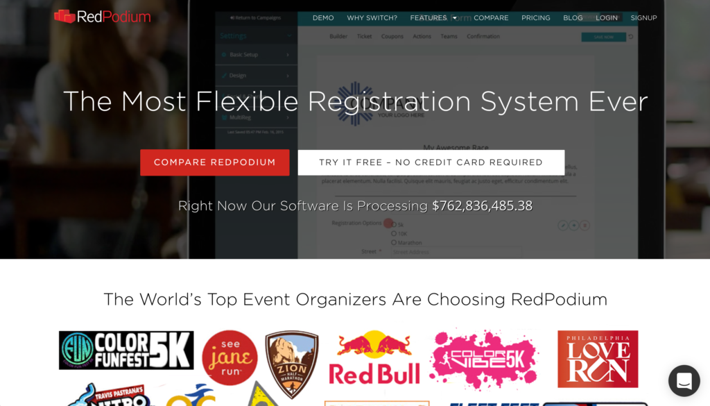
What’s the most important thing? The design says “Compare Red Podium” but I would say “Try it Free” should be featured more prominently.
Make primary actions stand out. If they’re starting to feel too prominent, you’re on the right track.
2. Reward the scroll
Scroll to the bottom of your site. If someone did all that work, did you reward them with a rich footer including menu options? Or just a copyright notice?
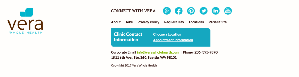
The footer of Vera’s site does a good job of featuring contact information as well as the primary actions people are likely to take. Contact information is key. Time and again we see look for a phone number by scrolling all the way to the bottom of websites during usability testing.
3. Break out your phone (and borrow a friend’s)
If you haven’t visited your website on a phone in a while, time to do it again. We have clients with as high as 50 percent of users visiting a site on a mobile device.
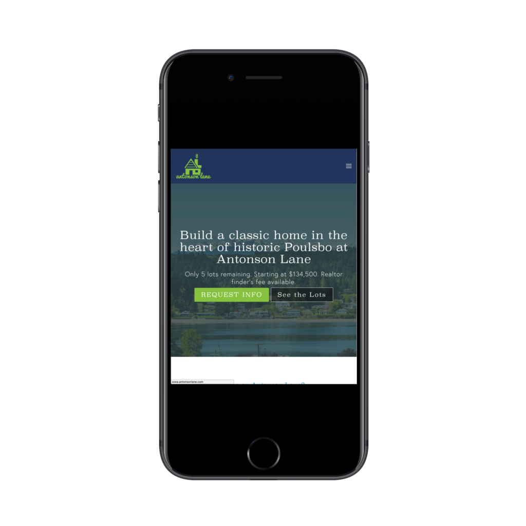
When you look at Antonson Lane on your phone, the most important information is on first screen, no side scrolling (ever) and no vertical scrolling needed to take an action. Borrow a friend’s Android if you are on iOS. The site may look different, but you’ll notice new things by visiting the site with an unfamiliar device.
4. Change the language
Pop your URL into Google Translate and view the results. Really. It’s best if you pick another romance language (Spanish, French, etc.) if your site is in English.
Why translate your site? People scan more than they read websites. Chances are, you’ve trained your brain to anticipate what it will see on your website. You may not be seeing the forest for the trees.
By switching the website to another language, you will be forced to use color, positioning and size to determine what’s important. Ask yourself the first question again: “Is my primary action clear?” It should be possible for someone to guess what you want them to do even if they can’t read your page.
5. Go all the way
Remember that primary action we identified in point one. Try and complete it, but only use your non-dominant hand. Seriously, type and mouse around with your left hand if you are right handed, or the other way around. It’s just another exercise to get you a bit disoriented, a bit closer to your user probably interacts with your site.
How many steps did it take? Was there something that was hard to click on? Did you think about giving up? Take note of the frustrating parts and imagine how you might change them.
Rinse Repeat
That may take you more than five minutes, but not that much more. Most importantly don’t think of this as a one time effort. Every few months go through and repeat these steps. To level-up your website usability consider doing in-person usability tests.
This is where you sit someone from outside of your organization in front of a computer and ask them to accomplish tasks on your website. You observe them and take notes while they do.
There will always be blindspots that real people shine a big ol’ spotlight on.
Originally Posted on A Brave New